Are Modern Brochure Websites Still Effective?
What Are Some Features/Functions Of Modern Brochure Websites?
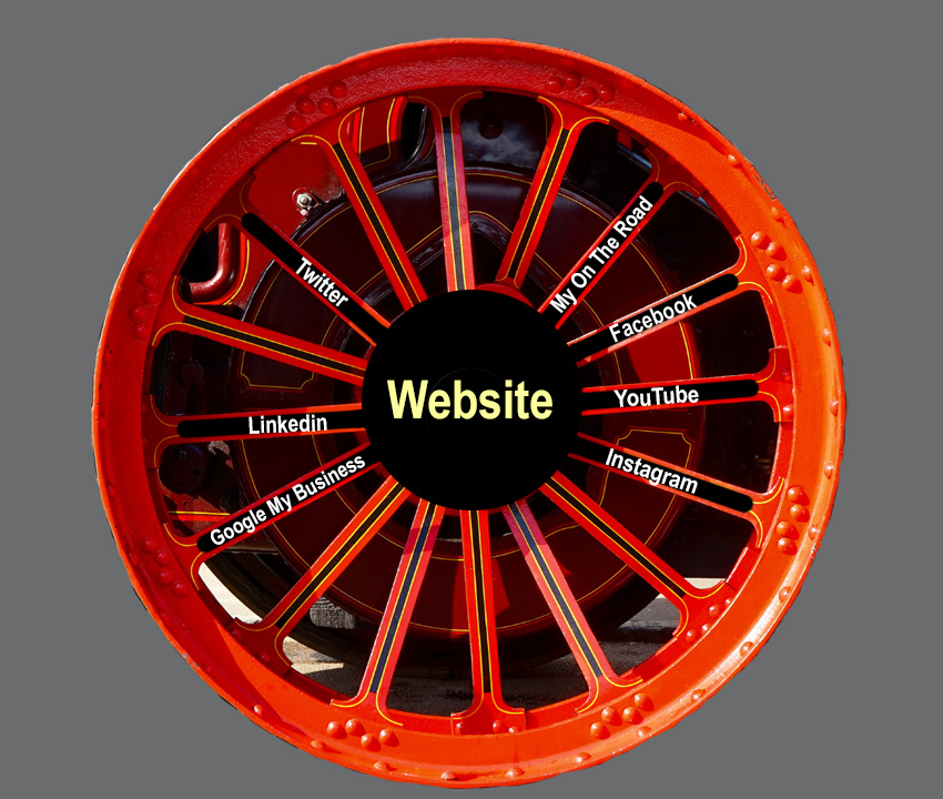
Modern brochure websites are designed to inform, educate, and acquire new customers within a strategic framework as the hub of your online presence, with spokes radiating in from additional marketing assets.
A modern brochure website is:
- An information Hub (often containing multimedia content with some interactive elements.)
- A business website designed to support your sales message. It is demoralizing to a sales team when a business’s website undermines a salesperson’s presentation. This could be from stale information, typos, or misinformation.
- A source of inbound Lead Generation.
- The foundation upon which your continuously improving website is built.
How important is a website in the customer acquisition process?
How important is your website to your business?
How your website fits into your overall marketing and business strategy will determine key features of a website’s design. What does the website need to do to achieve your business goals. One of the first decisions is to determine what you are trying to achieve and do with the website. What is the main purpose of the site? Is a modern website going to offer you a sufficient ROI (return on investment?)
The advantage of a well designed information/brochure website is that it’s lays the foundation for an efficient starter site. The starter site gives a robust structure for continuous website improvement. A starter website not only give you a solid framework for building future growth, it also plays a significant part in acquiring new business as soon as it is up and running.
If the lifetime value of a customer is $40,000 and your new site brings in one new customer every 3 months that would bring you $120,000 a year in gross sales. The hard part is figuring out the net to your bottom line. What is the net? What is the real income the site generated? In addition to the solid ROI numbers is the hard to measure goodwill and market presents that your website brings.
What features are needed for your business right now. What are your business’s immediate needs and what can be put off until the future. When developing the structure of a site it’s beneficial to have an idea of what functionality may be needed in the future. Once we’ve determined the purpose of the site and the functionality needed then we can decide if a brochure website is the right place to start.
Often an information or brochure website is the best way to launch a Small business Starter Website for Non-Technical people.
Traditional Brochure Website vs a Modern Information Brochure Site
Traditionally brochure websites consist of 4 to 15 pages that didn’t change much.
Old school brochure websites are rather static sites that are not regularly maintained or added to. Many old style sites are not given the attention they need to keep up to date and optimized as search engines change algorithms. In addition, old style sites don’t consider the changing popularity of social media platforms or the dictates of social sites.
The most detrimental feature of old style brochure sites is they don’t make the incremental changes needed to optimize customer acquisition. This is why it is so important to implement a Continuous Quality Improvement strategy with a new website launch.
Those who know me realize I enjoy the work of Edwards Deming and you can be sure I’ll incorporate many of his ideas into how I do website design.
Generally websites with ecommerce components are not considered brochure websites. Adding complex interactive elements also moves a website out of the brochure category.
A modern brochure style website can be highly funchal and do more than act as a glorified business card.
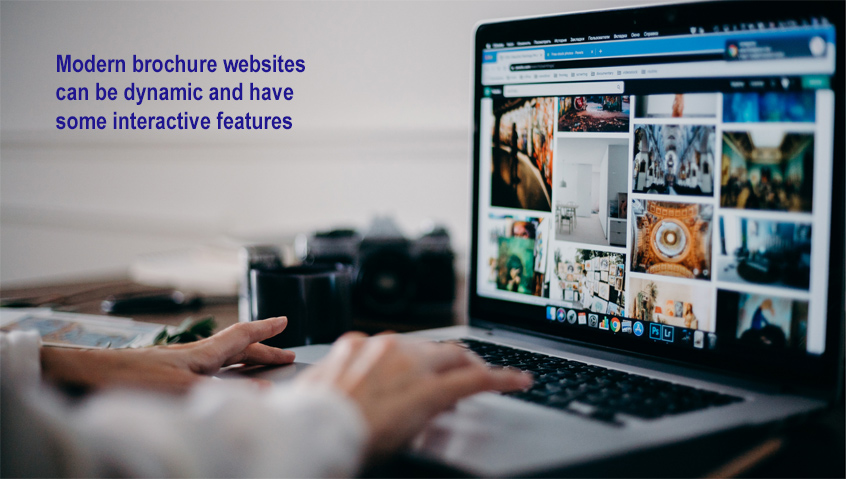
Modern brochure websites can have limited interactive elements.
Modern brochure websites of today are quite a bit more dynamic than the old school sites of the early 2000s. In fact they often have enough flexibility and growth potential that many people put them into a separate category.
Modern brochure websites can have interactive elements.
Think of the first iteration of your website as the starting point for a more robust lead generation and sales platform.
The first iteration of your new website is often the Starter Site stage of an overall website strategy.
The Business or Information Website.
A modern brochure website is more appropriately called an information site or general business site. It’s purpose is to give prospects useful and educational information while gathering useful information about your ideal customer. It needs to help move the sale along while giving past customers a way to refer their friends. If done well your information will motivate and educate. When you have an educated and motivated site visitor they are more likely to contact you. This is how your website will contribute to inbound lead generation.
When you’re ready to get more information on your new website head on over to the Website Design page and tell us a little about what you’re looking for.
In reality, information business sites have always done better than simple brochure websites. Even in the late 1990s and early 2000s.
With the addition of a blog, contact forms, and tracking, the modern brochure website is transformed into what can be classified as a business website. I think a business website’s primary purpose is to educate and generate leads. The lead generation business website is quite a bit different than an ecommerce site. The ecommerce site is designed to take monetary transactions on the site itself. Where the lead gen site is designed to get inbound leads that convert to sales. The sales from a modern brochure website are often done offline or offsite.
Some people also call product showcase websites and service showcase websites a brochure site.
The idea is to go from thinking of your website as a static brochure and instead thinking of it as a continuously improving information hub. This is the hub that all your other online and offline assets point to.
A modern brochure website can also be used as a central hub for doing marketing experiments. This may include advertising, although I prefer to find sources for organic website traffic.
A brochure website is all you need to track the effectiveness of many offline promotions. A very simplistic example is if after developing a new referral partner I see web traffic go up in that city or area I can deduct that my marketing is working. When these potential customers contact me I can verify if the hypothesis is true.
It used to be fairly easy to get good search engine ranking even with an old style brochure type of site. Once Google became the dominant search engine, small sites lost much of their ability to organically gain high ranking on search engine pages.
It’s a common belief within the SEO marketing community that small websites can’t rank in organic Google search results. This may or may not be true. It certainly seems that way. However, Google denies it. In theory Google says a small site can rank. In practice it is unlikely.
Now that Google is pushing their maps and GMB (Google My Business)/Business Profile) properties it is once again fairly easy to get a small site onto the first page of a local Google keyword search. Provided you have a local presents. Building rank and getting on the first page of a Google search involves a combination of website design, SEO, and local search optimization. So Yes, it is possible to get good traffic with a small website.
Do brochure websites convert?
Is it true that brochure websites don’t convert?
Once you start getting traffic to your website you need to turn the traffic into new business. I’ve read that some web developers and designers think a brochure website doesn’t convert.
I Don’t Believe It!
On what do I base my beliefs?
Well, because I have relied on what I consider a brochure site for new business for many years. I admit, it has changed drastically over the years. It has gone from many websites to quite a bit fewer. This is because as the marketing environment changes so does strategy. The site is now larger than in the early days of the web. It may not even quite qualify as a brochure site anymore. But you know what? It’s still pulling in new clients. In the future I’m planning on adding functionality that will completely change it to a different type of site.
In fact the site you are now on, MyOnTheRoad.net, at the moment, is what I would consider a modern brochure site. However it’s sister site is not.
As a modern brochure website MyOnTheRoad.net is built so that it can grow into something much larger and more complex. How will the direction of the site be determined? I will be guided by the Plan-Do-Study-Act Deming Wheel (formerly known as the Plan-Do-Check-Act wheel.) The Plan-Do-Study-Act Wheel will be used to direct how we implement incremental continuous quality improvements.
What is a website conversion?
Before we know if we’ve had a conversion we need to determine what a conversion is. Is it registering for your email newsletter? Or filling out an information form, or perhaps it’s a phone call.
I have used a website for years to attract new clients, qualify who should contact me, and to generate leads through phone calls. The website becomes an important part of the customer journey.
There are some minimum requirements for a website to become a source of new business.
- First it needs to provide a way to conveniently contact the business.
- Next it needs to answer the customer’s questions. Even if that question is only how do I contact the business. In general the more questions you can answer the better chance a qualified customer will contact you.
- For lead generation your website should have a clear offer. People need to know what you do and how it will solve their problem or make their life better.
- It should have some kind of call to action. This could simply be a statement like “for more information call” – with the phone number.
The Starter Websites I specialize in are modern brochure websites. Like a little acorn that turns into a mighty oak tree, these sites are designed as a foundation, or starting point for a more compelling and influential site in the future.
One the website is up and running we can iterate with continuous improvements, shaped by customer insights.
The starter site is simpler than an ecommerce site but usually more complex than the old fashion static brochure sites.
Get more information about how we can help your business with a modern lead generation brochure. website and local marketing by filling out the information on our Web Design page.

